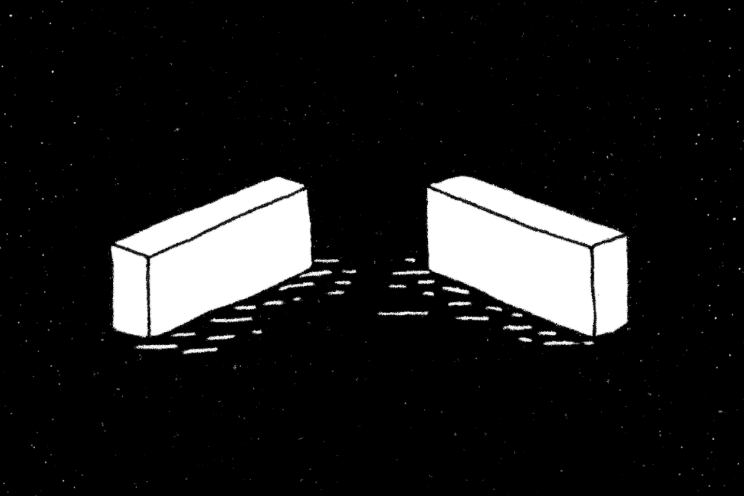
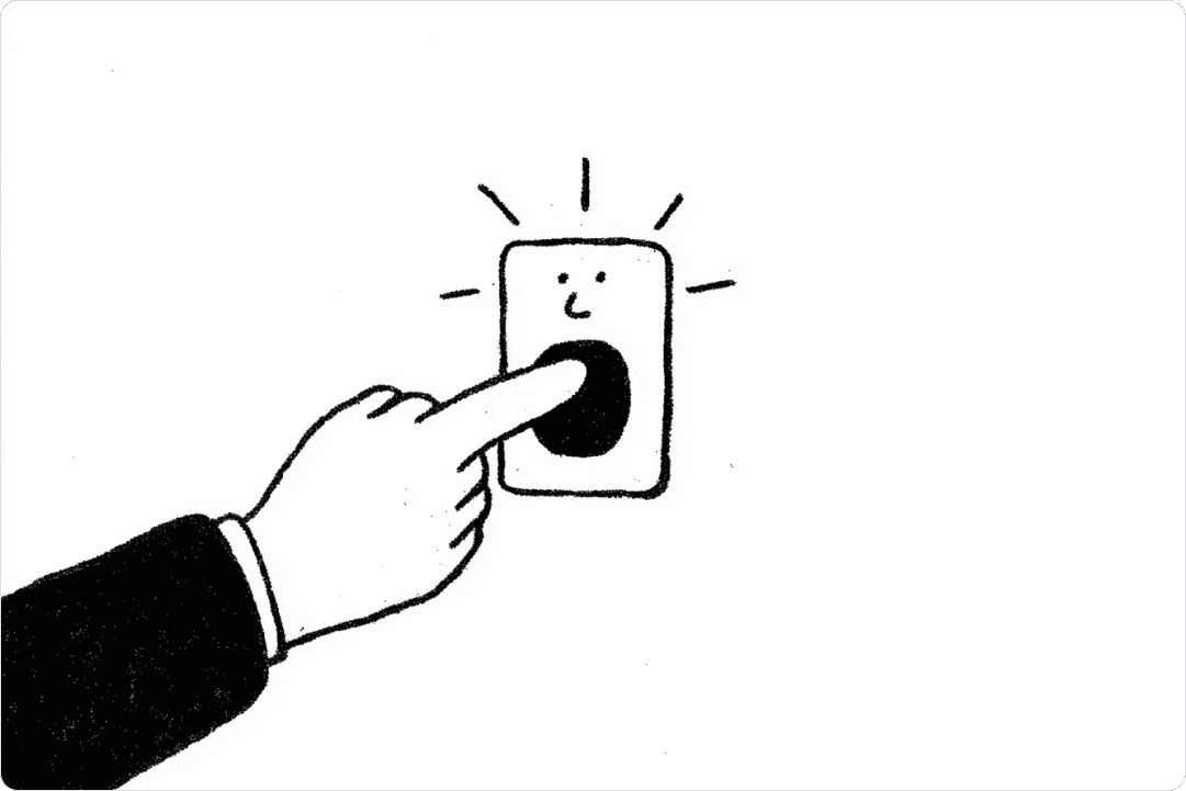
Two versions of the same page go live at the same time. One with the explanation screen, one without. A few thousand people see one, a few thousand see the other, and after two weeks a number appears: version B produces more completions.
That number costs nothing but waiting time. It’s reproducible. And it ends every argument in the room.
What it doesn’t measure is the person who needed the explanation. She didn’t drop off in version B. She came through, faster in fact, and agreed to a figure whose origin she doesn’t know. In the analysis she shows up as a success. There is no column where her misunderstanding would appear.
Simply reinstating the explanation screen doesn’t fix it. It was there, in version A. And version A lost.
* * *
I’ve been designing financial products for ten years. I know which option has to be preselected for it to be chosen. Where a notice has to sit to be read. And where it has to sit to be overlooked without anyone being able to complain later.
That last one is rarely deliberate. Usually it’s the by-product of the same method you use to make things easier. You remove one obstacle. Then a second. Each of those decisions is reasonable on its own, and across a thousand of them you get a surface where nothing catches any more.
The information itself rarely disappears. What disappears is the time in which you could have checked it.
I’ve tested explanations like that myself. Better meant: fewer drop-offs, fewer support tickets, better scores in the satisfaction survey. Whether anyone could afterwards explain what the system does with their data — we measured that in none of those rounds. You’d have to make them explain it, and a test cycle has no room for that.
That says nothing about intentions. Most people in my industry are smart, well trained, and want to build products they can be proud of. It says something about the direction such tests push a piece of text. Refine an explanation until nobody asks about it any more, and you’ve optimised it for the absence of friction, whether or not you meant to.
* * *
Here I have to correct a term I used wrongly myself for years.
In UX, friction is almost always a problem. “Frictionless” is the highest praise a digital product can receive, and commercially that’s inevitable: friction costs users, every moment of hesitation is a moment in which someone leaves, and that relationship measures cleanly.
The obvious counter-argument says you should build resistance back in. Make it a bit harder. Insert a step that forces a pause.
That counter-argument doesn’t work, and the research is more decisive than I’d have liked. Hard-to-read type does not improve learning. Perceptual obstacles don’t produce understanding, they produce effort. Build friction in as an end in itself and you don’t get more alert users, only slower ones.
What actually helps is something else and less catchy: a check step built into the flow, and into the organisation behind it. A point at which asking is required rather than penalised. Not “make it more awkward,” but “build in a place where someone has to establish whether the other person knows what’s happening” — and measure the result rather than leaving it to chance.
That’s a process and organisation problem, not an interface problem. Which is why no redesign will solve it.
* * *
One objection I underestimated for a long time, and it carries weight.
For people with reading difficulties, with cognitive impairments, or living their daily life in a second language, smoothness isn’t a trick — it’s access. Awkwardness quickly becomes a gatekeeper for them. Demanding “more friction” in general terms builds barriers for precisely the people with the least in reserve.
So the question isn’t whether a surface is allowed to be easy. It is, and usually it should be. The question is where in the flow it shouldn’t be.
A comparison helps here. Count up how much resistance you meet on an ordinary morning. To reach an article: consent banner, sign-in, paywall, newsletter pop-up after the third paragraph. To open an account: ID, video identification, confirmation code, waiting period. To send a larger transfer: a prompt asking whether the details are correct.
The whole apparatus stops you where money moves or an identity has to be verified.
Then you read an explanation that changes your picture of something, and nobody asks. No confirmation step, not a second of delay. You read it, it makes sense, it’s in.
The passage from read to believed is the least controlled point in your digital day — and the only one where the control would be yours.
* * *
For some time now an additional ingredient has been sharpening this. AI-generated explanations. Recommendation rationales. “Why you’re seeing this” — tooltips and short paragraphs meant to explain why the system recommends what it recommends.
These explanations are friendly and plausible. They serve a function that’s rarely stated out loud in practice: they end questions.
Not: they answer them. An answered question is one you now understand. An ended question is one you no longer ask. When a box appears with plausible words in it, nobody asks further.
We spent decades optimising against friction. Now we have tools that don’t merely remove friction but supply explanations creating the impression that friction has become unnecessary.
* * *
What happens in finance apps happens in news feeds, in search results, in answers from language models. Anywhere systems deliver something that sounds fluent, and where the metric deciding success doesn’t measure whether anyone understood.
I didn’t leave. I’m still building. But I ask different questions while I do.
No longer only: how do I make this easier? But: where in the flow should it not be — and who checks, at that point, whether anyone knows what’s happening?
Because that checking costs time and concentration, and both are unevenly distributed. Someone under pressure, tired, doing three things at once, doesn’t have the attention it demands. The burden of staying alert falls hardest on those with the least room to manoeuvre.
Anyone building systems should therefore not leave that burden to users’ self-discipline. This isn’t an ethical add-on. It’s the work.
* * *
The full essay on this topic: